Colors, typography, and atomic design

summary
In 2021 I started at Stavvy as their first in house designer. Prior design was done by contract work and the company had no existing figma design system, 6 different color palette versions that were used, and no set typography.
I created their first documented color palette and typography system to be used company wide and started auditing the current product in order to start work on the component design system.
Colors
The founders had a specific color shade in mind for the primary color. My first task was to compile all the colors the company was currently using and discuss the existing color schemes and naming conventions with the development team. Based on their feedback and the necessity to maintain consistent naming conventions, I created a new palette that integrated seamlessly with the current system, avoiding the need for significant development updates.
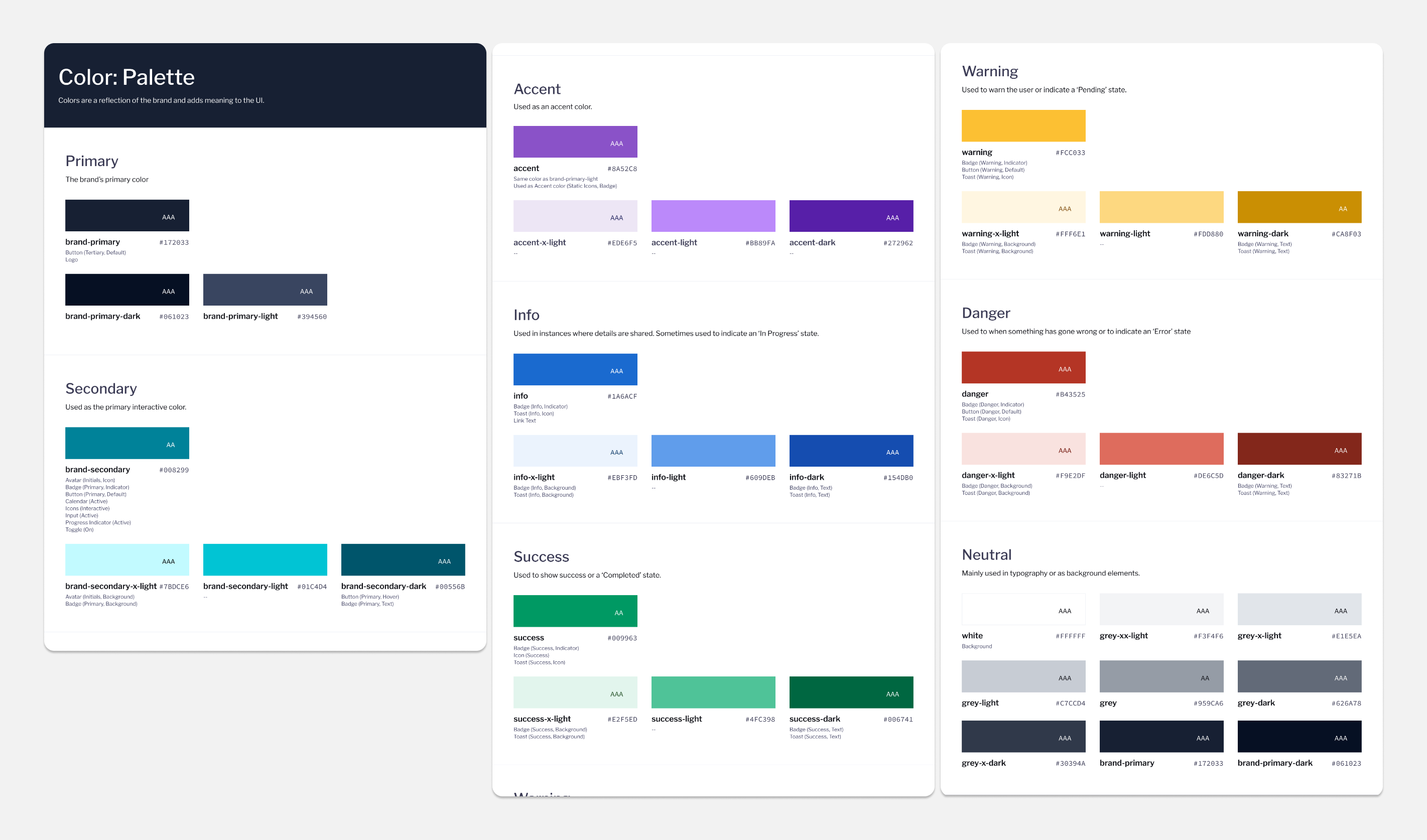
After a year, the company began expanding its marketing department. The marketing team then hired a firm to revamp our branding. I participated in numerous meetings with the marketing team to ensure that the new palette adhered to web accessibility standards and was suitable for seamless handoff to development. The marketing team has since undergone two phases of branding updates.
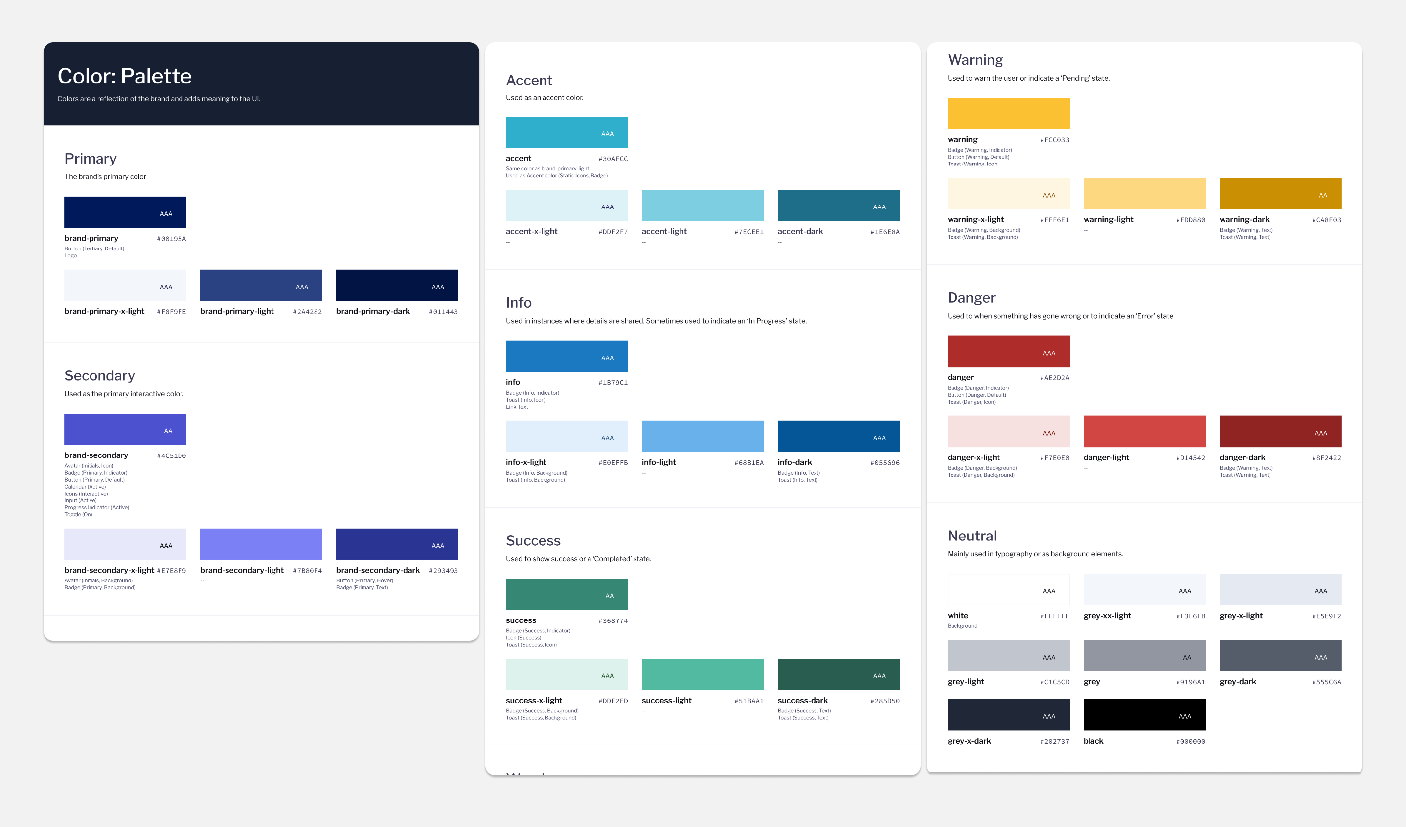
The biggest challenge during feedback sessions was that the marketing team prioritized print over web, resulting in little consideration for web accessibility. After multiple rounds of feedback, this led to the development of slightly different palettes for web and print while maintaining as much color consistency as possible.
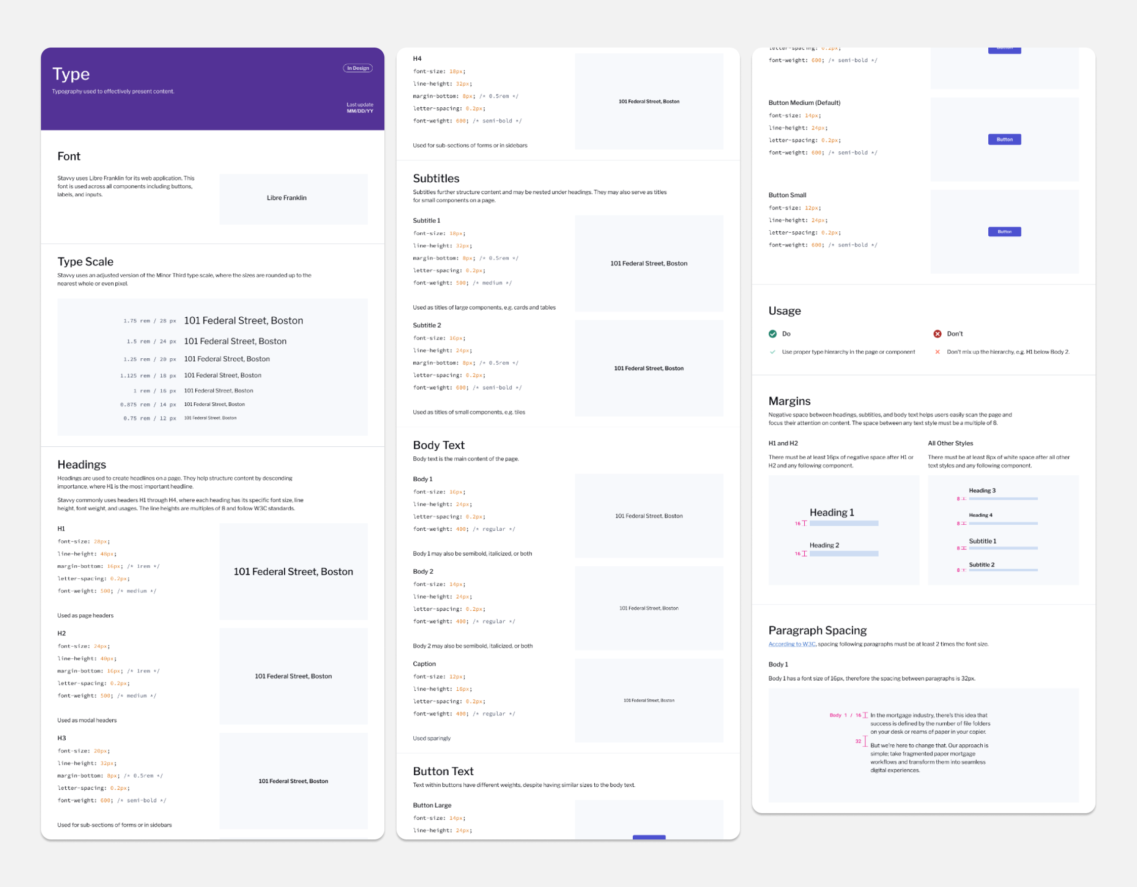
TYPOGRAPHY
Stavvy needed a font that was highly legible in small spaces yet sufficiently condensed to optimize space in content-heavy areas. I conducted multiple rounds of font testing in collaboration with the development team to identify the best option. We ultimately chose Libre Franklin for its ideal balance of readability and space efficiency, while Poppins was a close runner-up but was too wide for our requirements.
Design system
After a few months at Stavvy, another designer and I initiated a comprehensive audit of all existing components and designs. We gathered elements from both Figma files and the current product to assess their locations and functionalities. This thorough evaluation was essential for constructing our new design system.
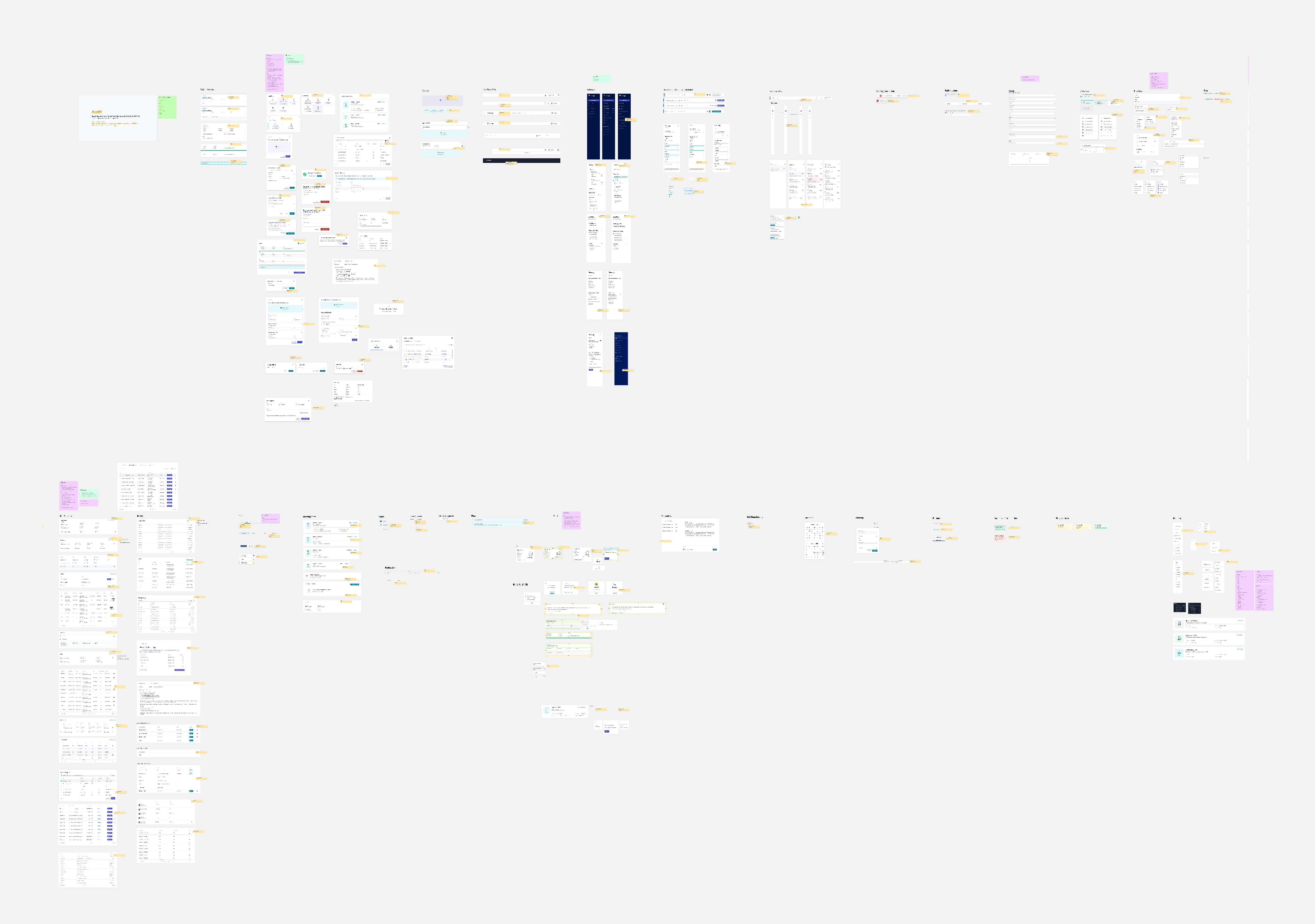
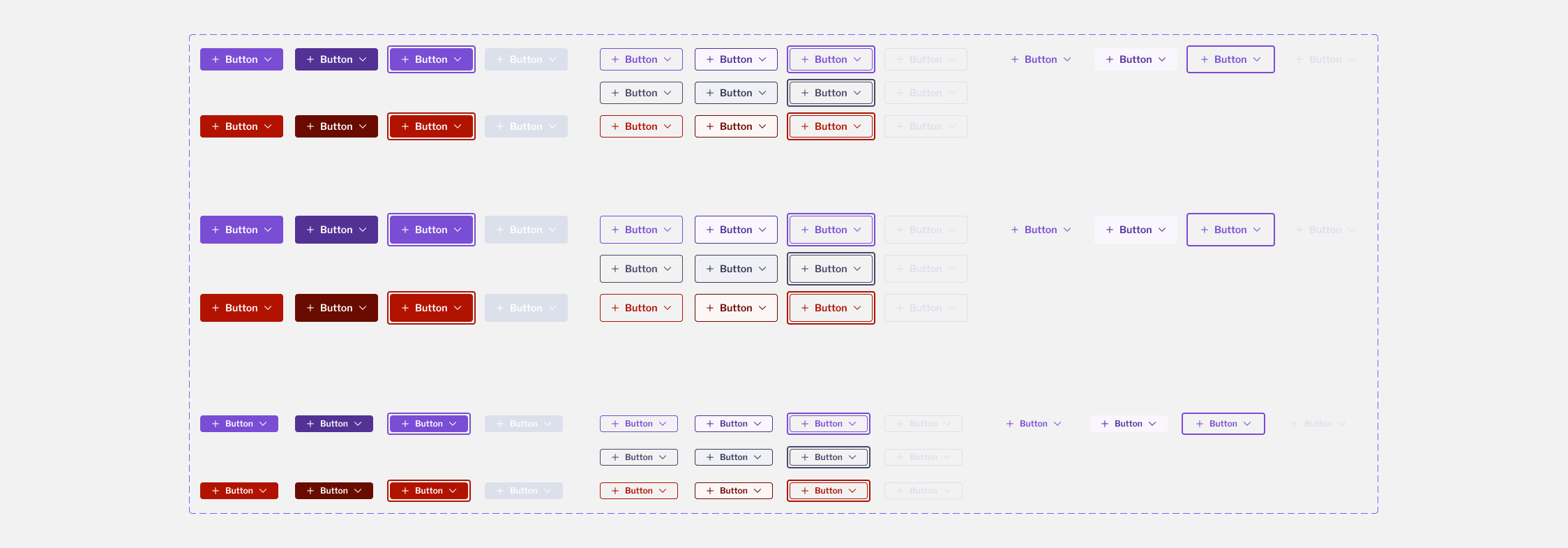
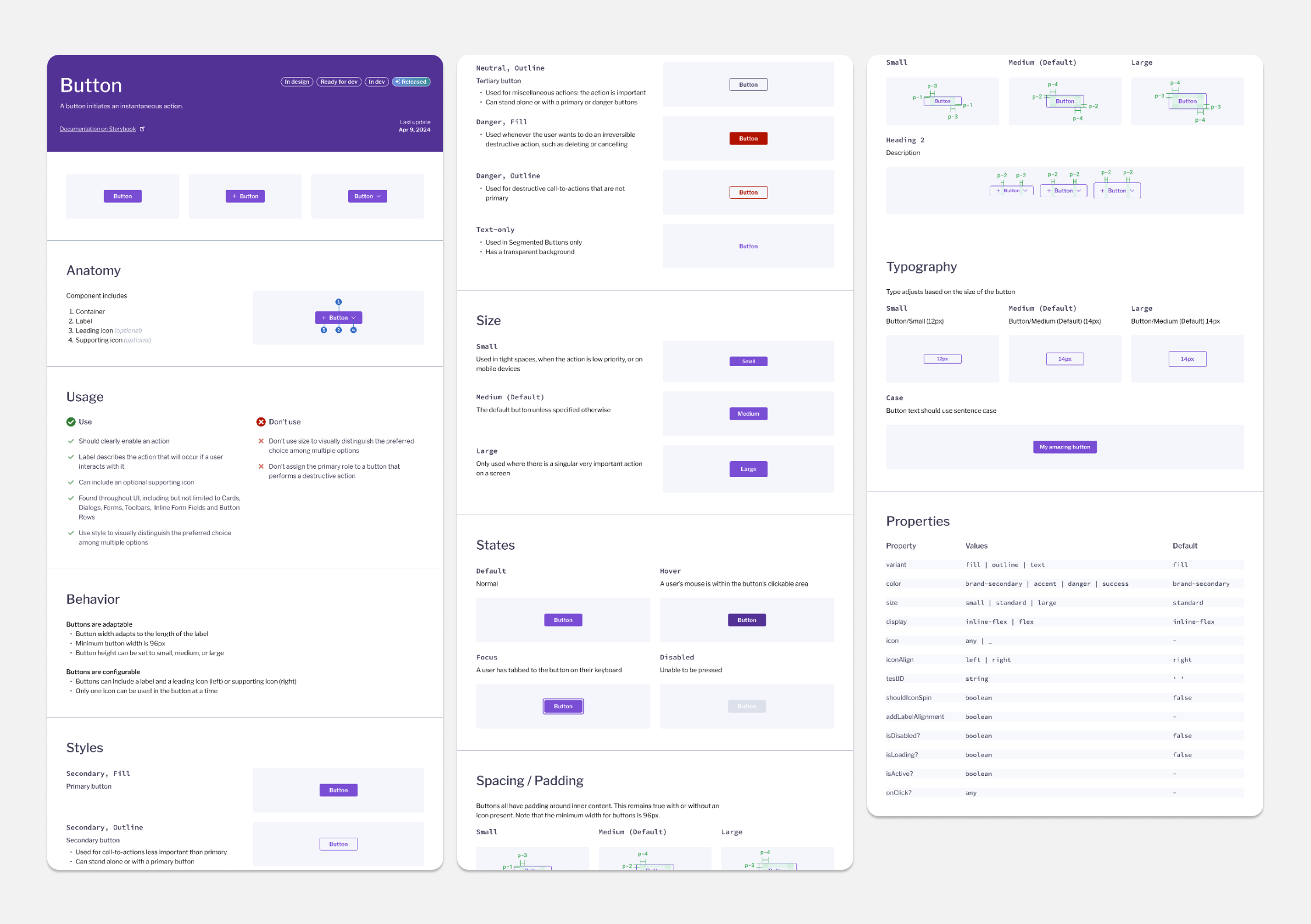
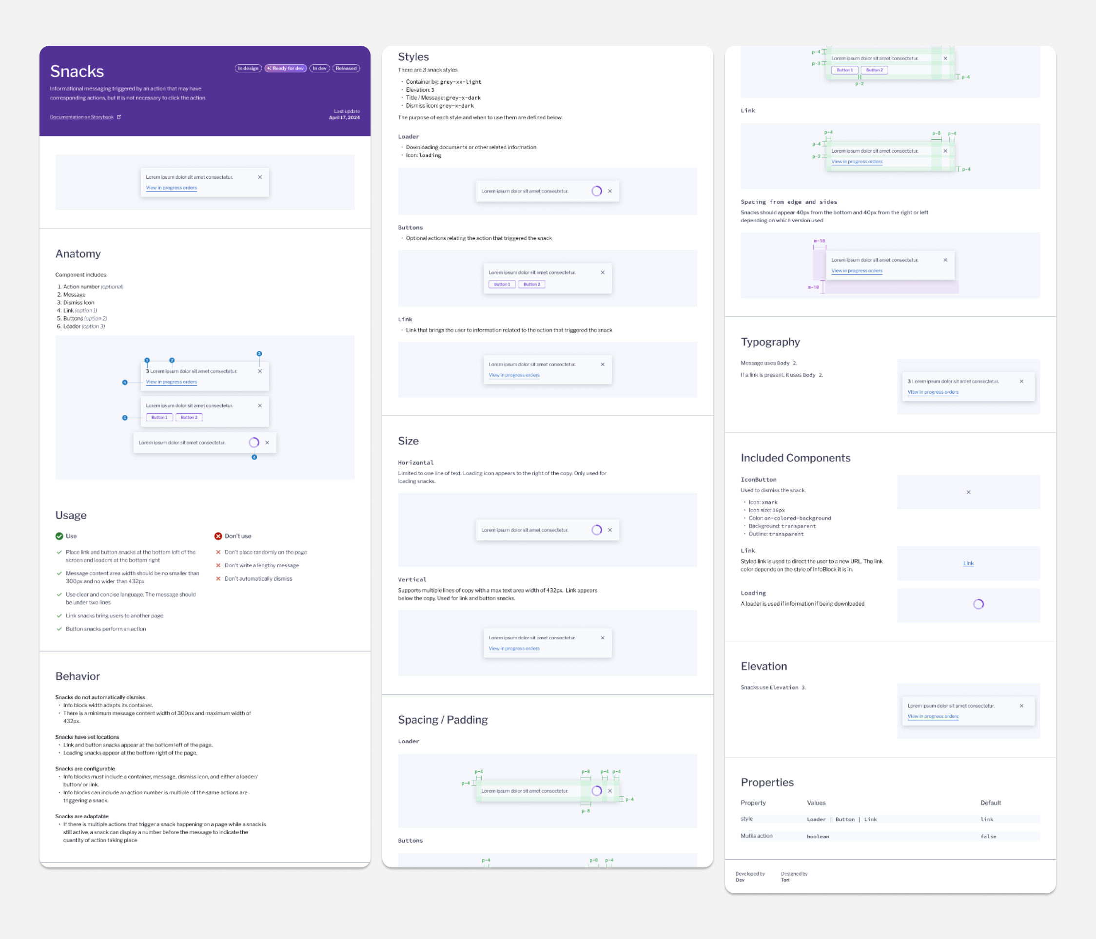
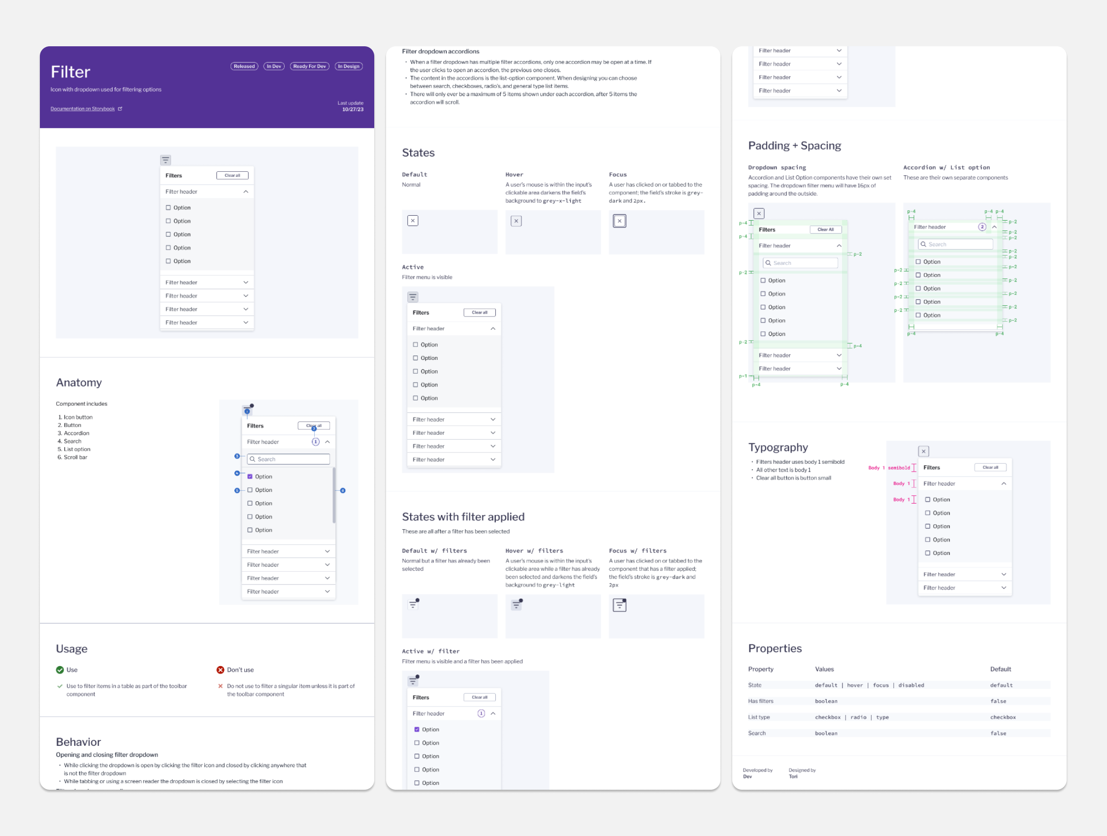
After auditing the system, we came up with a list of components that needed designs and documentation. These new components were built using the atomic design system. During the creation of each component I would list out every functionality that I needed the component to have and researched best practices and accessibility standards before creating designs. I had consistent design reviews and discussions with other designers and front end development before I haded off final documentation and created a Jira ticket for development. Here are some examples.


If you like what you see and want to work together, get in touch!
victoriaLbragg@gmail.com