Role
Research, conceptualisation, design, prototyping and dev-handoff of designs
Team
Product designer, product manager, UX researcher, 3 Engineers
Tools
Figma
Usertesting.com

summary
The existing document signing process at Stavvy was originally adapted from its meeting flow, and although it has undergone updates, there is considerable room for improvement. The objective of this project was to develop a completely new, standalone signing solution independent of the current Stavvy eSign and meetings product. A refined signing experience has the potential to drive significant growth, as each positive experience increases the likelihood of users sharing and utilizing the feature with multiple recipients, thereby expanding its reach and impact.
The problem
There have been a few key areas that users have consistently mentioned.
THE GOAL
Develop a user-friendly document signing process that seamlessly integrates PDF viewing, enabling users to review and sign documents with ease. Additionally, incorporate the ability to resize signing fields, empowering users to customize document layouts to suit their needs.
THE PROCESS
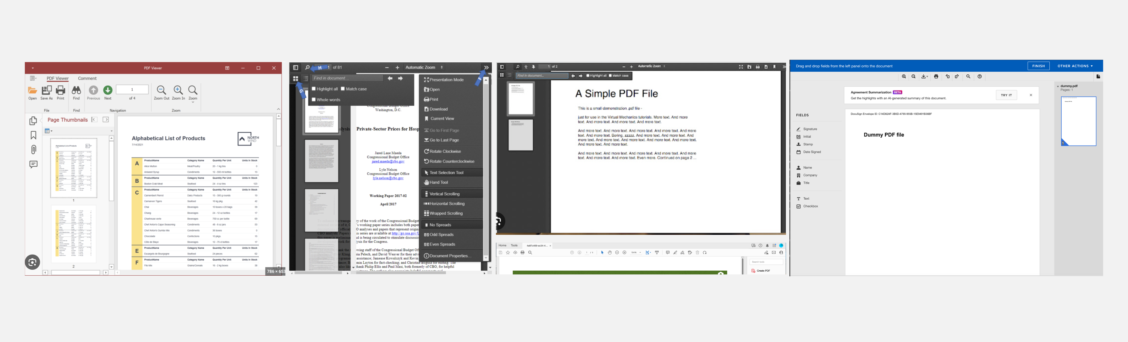
I conducted a lot of research on other signing competitors to see how they formatted their pdf editors and page viewers.
User flows
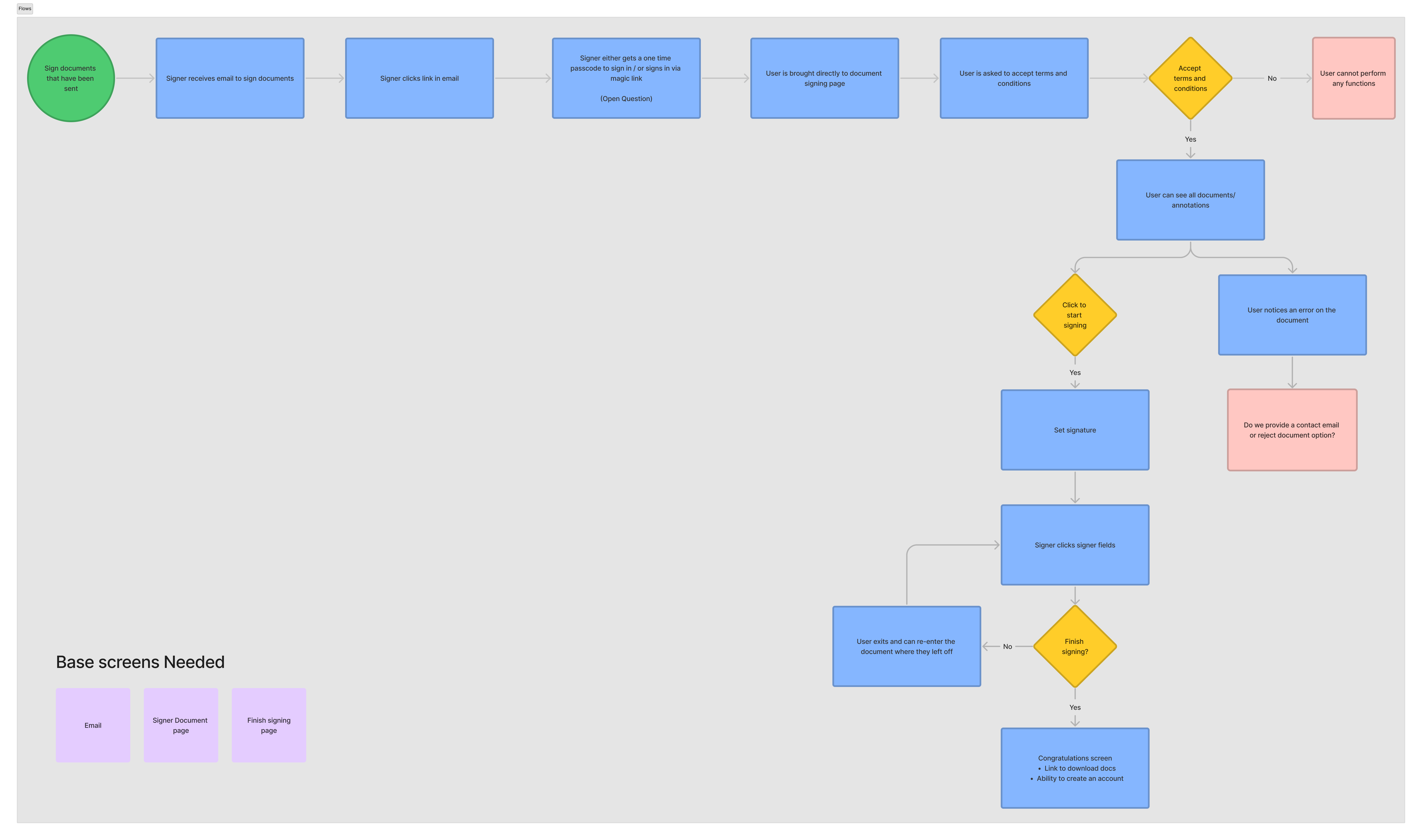
This user flow is designed to create a seamless document signing process that brings the signer directly to their documents, integrates PDF page viewing, allows a user to reject a document, and gives the user a landing location at the end of the process to download their signed documents.
ITERATING
A created a lot of prototypes for pieces of this project that went through testing.
Go to PROTOTYPES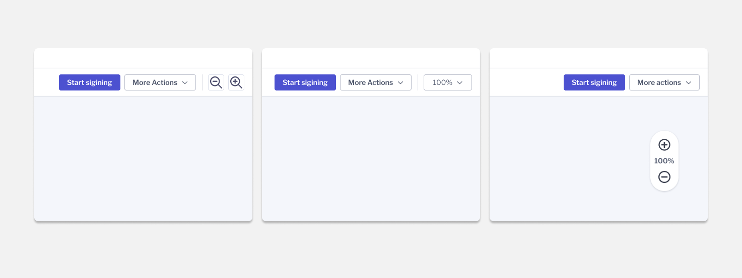
We tested users on zoom functionality with a floating zoom on the PDF viewer, dropdown zoom in the topbar, and button zoom in the topbar. Overall user reviews were very mixed with most users stating that they didn't have an opinion either way so there wasn't a strong enough consensus to hold opinion too far in one direction.
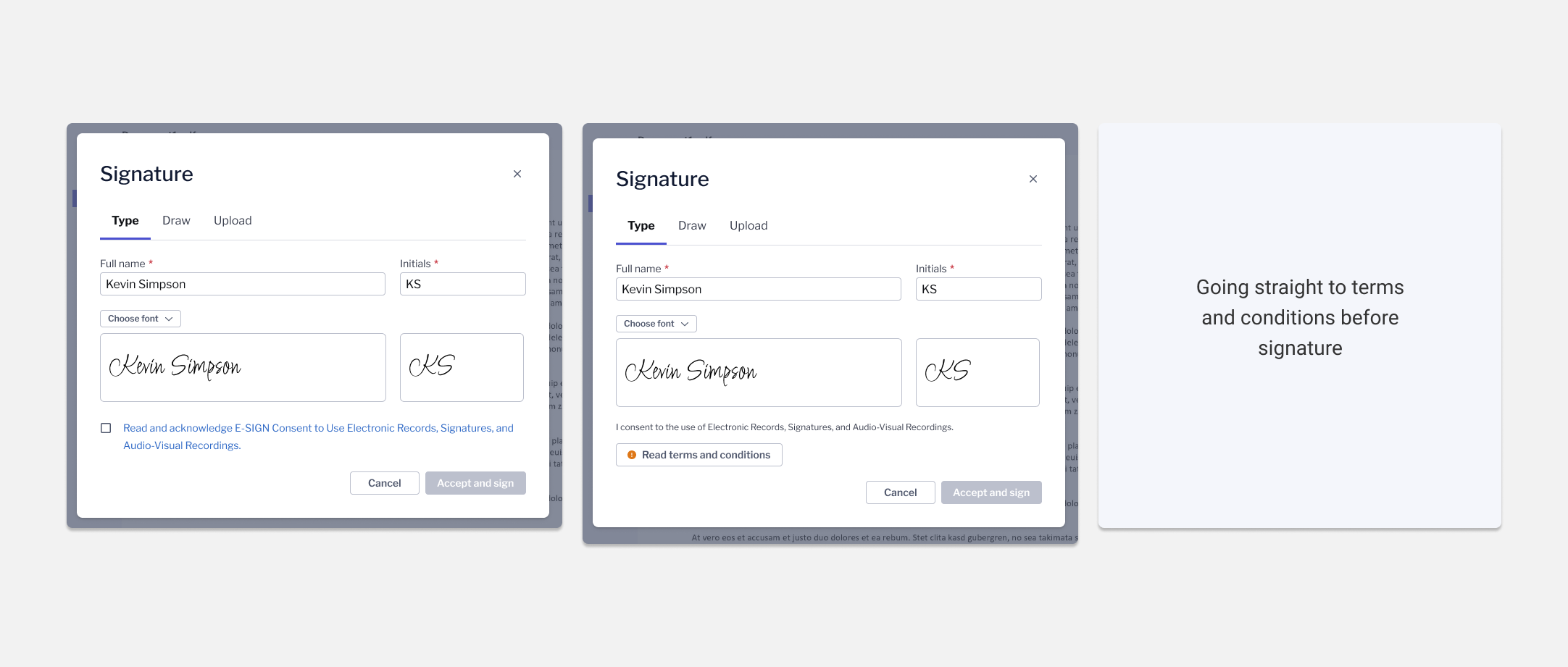
Some companies require users to read terms and conditions before they can accept their signature. I tested three versions. The checkbox and button automatically open terms upon clicking and the third brought the user straight to the terms to accept before being taken to the signature modal. Based off testing, users preffered being taken right to the terms so they wouldn't have as many clicks.
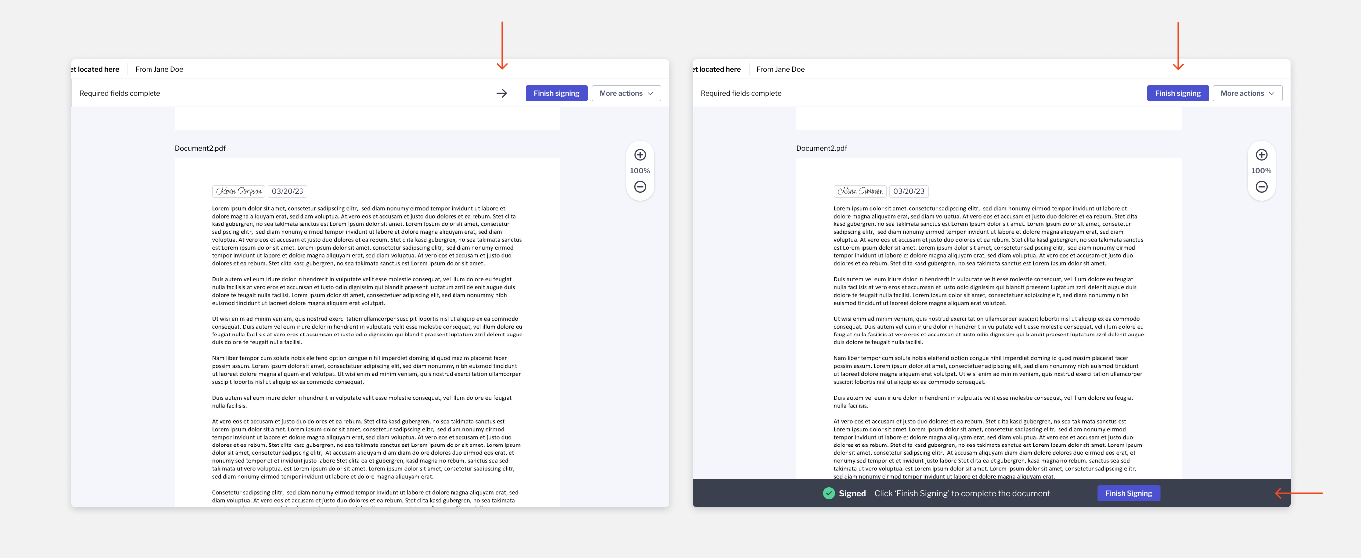
Current users often miss the finish signing button once they've finished signing fields. We can't legally finish the document automatically so instead we tested two versions of adding emphasis to the finish signing button. Overall more users preferred the version that added the finish signing bottom bar.
Signer gets an updated email and chooses how they would like to access their code.
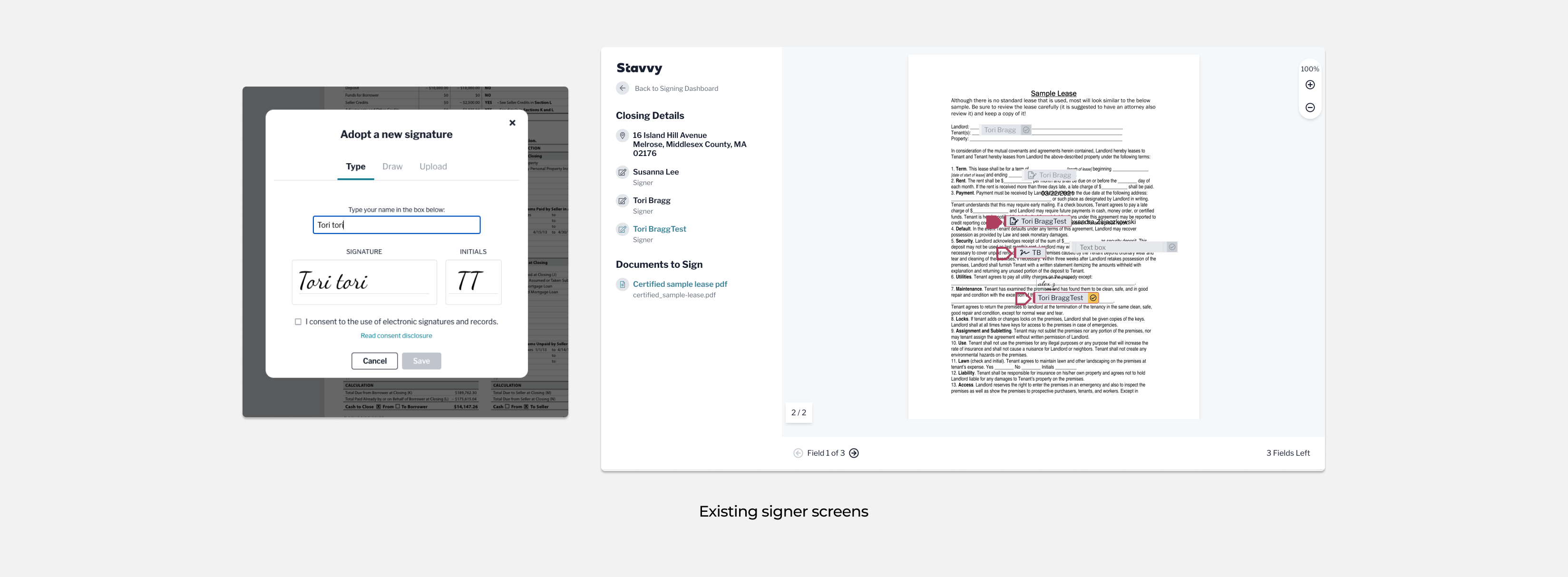
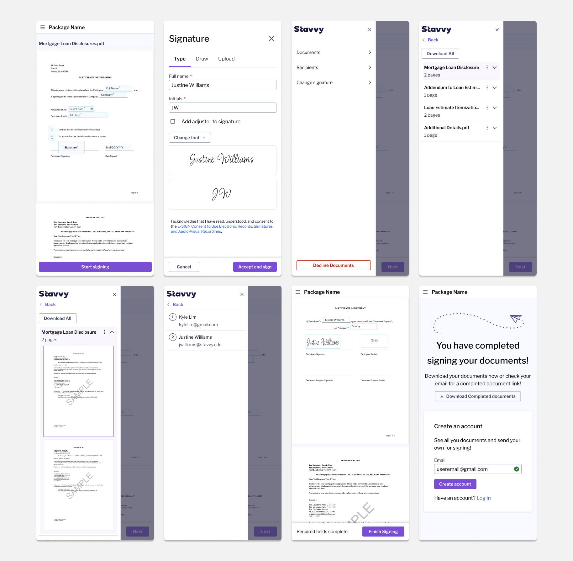
Once signers login they are immediately brought straight to their documents. When the first signing field is clicked, a modal will appear for the signer to set their signature.
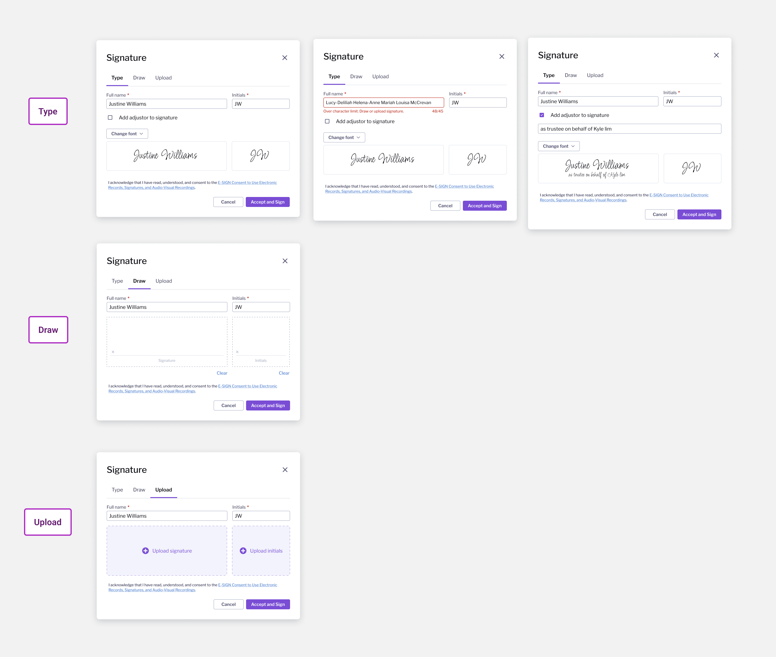
Users have an option to type, draw, or upload a signature and initials. If they choose to type we added the ability to add an adjustor - if someone is signing for someone else - or change the font they would like to sign in.
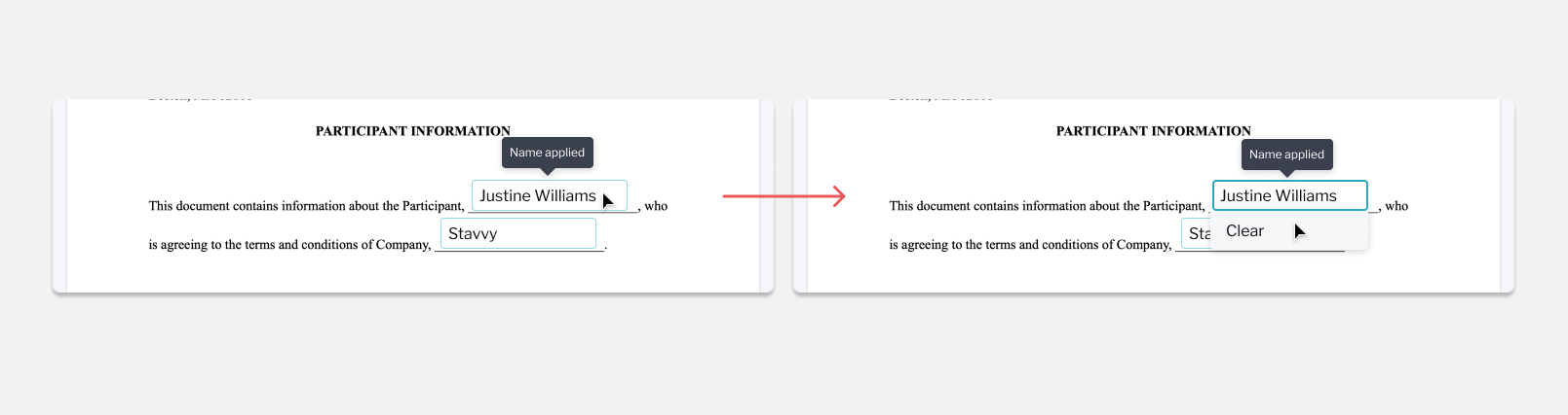
If a user wants to remove a signer field that they have already signed they can click the signed field and then click the dropdown to clear.
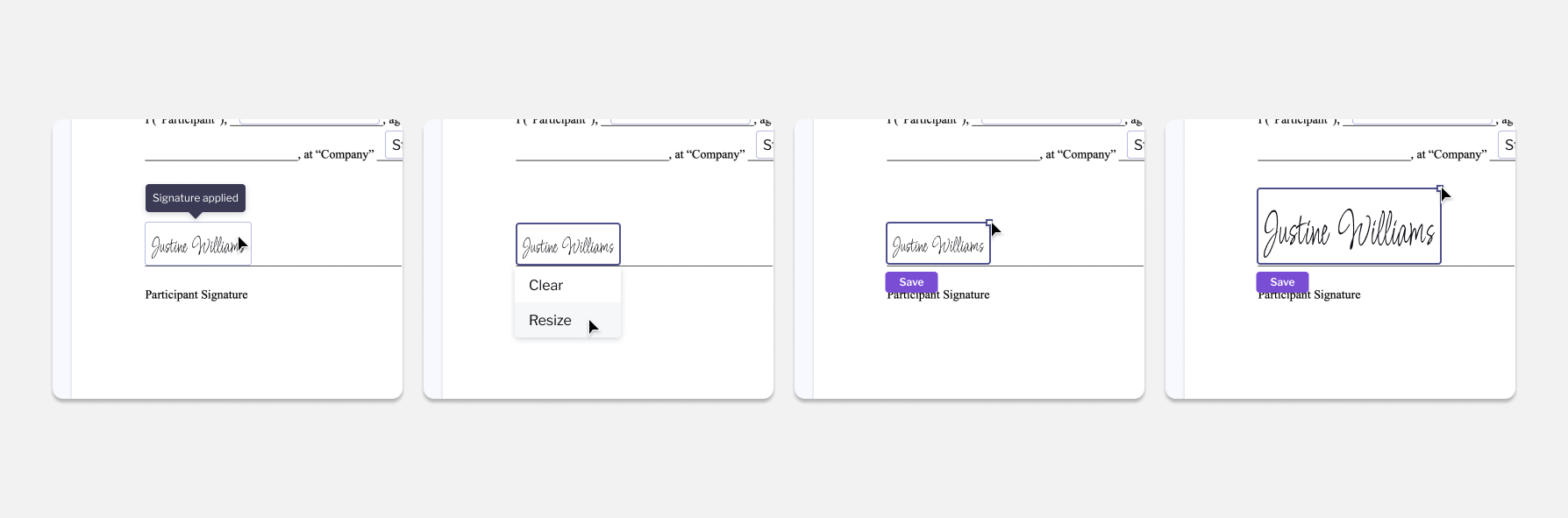
If a users name is too small to read when the field is clicked, a user may resize the field. When resizing the box will only scale from the top right corner so the left and bottom alignment will not move.
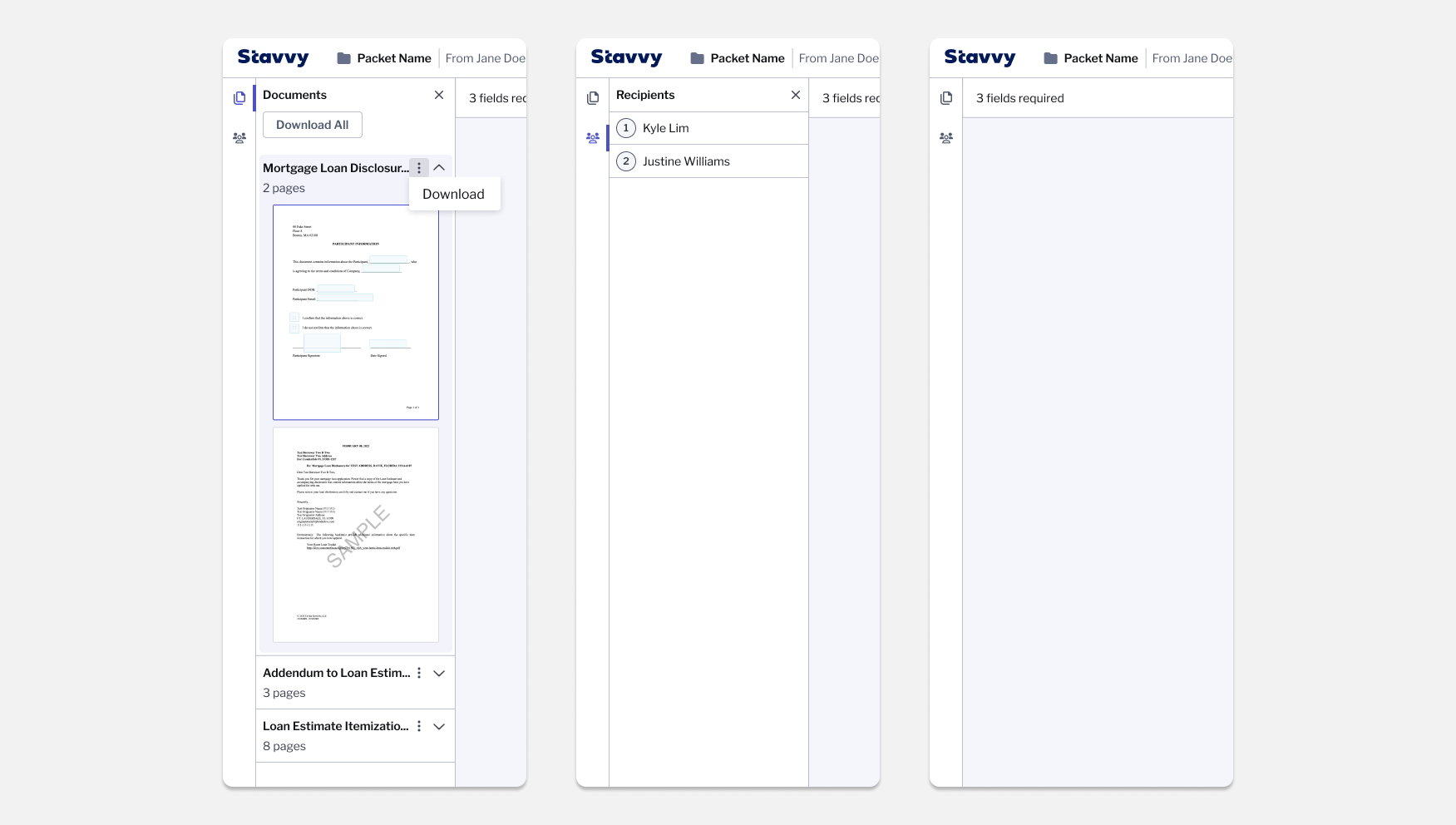
On the left sidebar, users are able to view all pages of their documents, download one or all, view recipients, or close the sidebar.
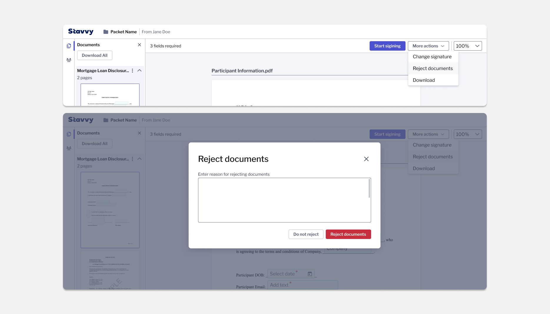
In the top bar users can start signing, change signature, reject documents, download, or zoom.
If a user wants to remove a signer field that they have already signed they can click the signed field and then click the dropdown to clear.
Signers are also able to sign their documents on their mobile device. On mobile the experience is simplified in order not to take up too much valuable room during the document signing. All actions not related to navigating signing fields and finishing signing has been moved into the hamburger icon in the navigation.
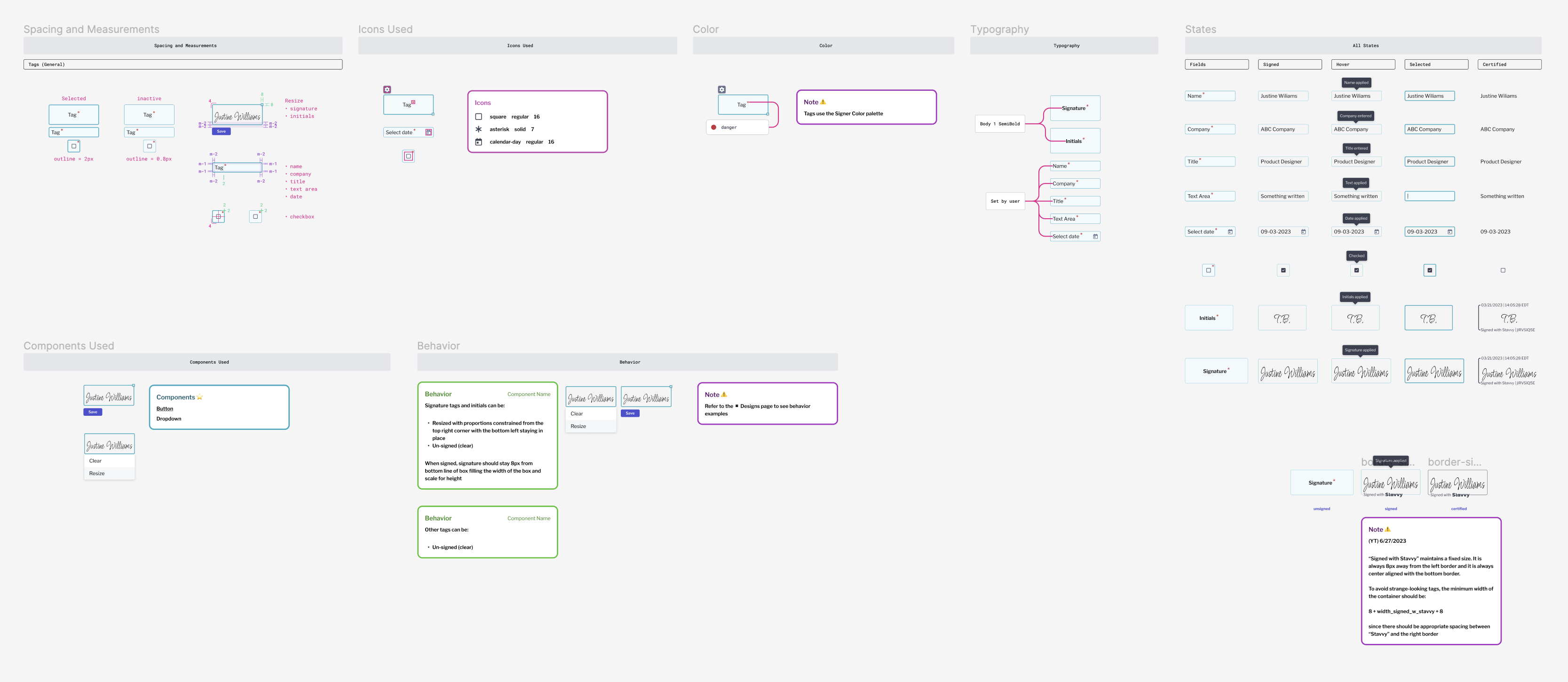
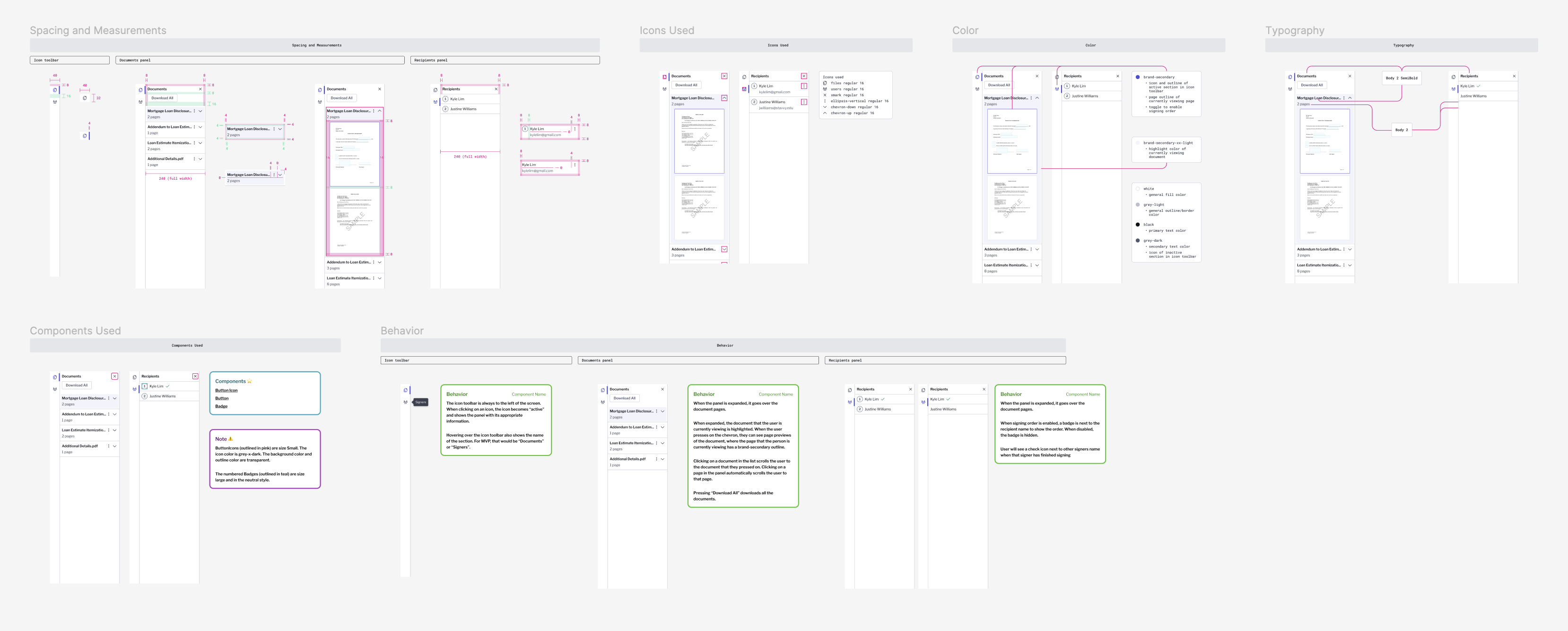
Developer handoff
Below are some examples of guidelines handed off to development.
If you like what you see and want to work together, get in touch!
victoriaLbragg@gmail.com