Role
Research, Wire framing, UI Design
Company
Datto - 2020
Tools
Figma
summary
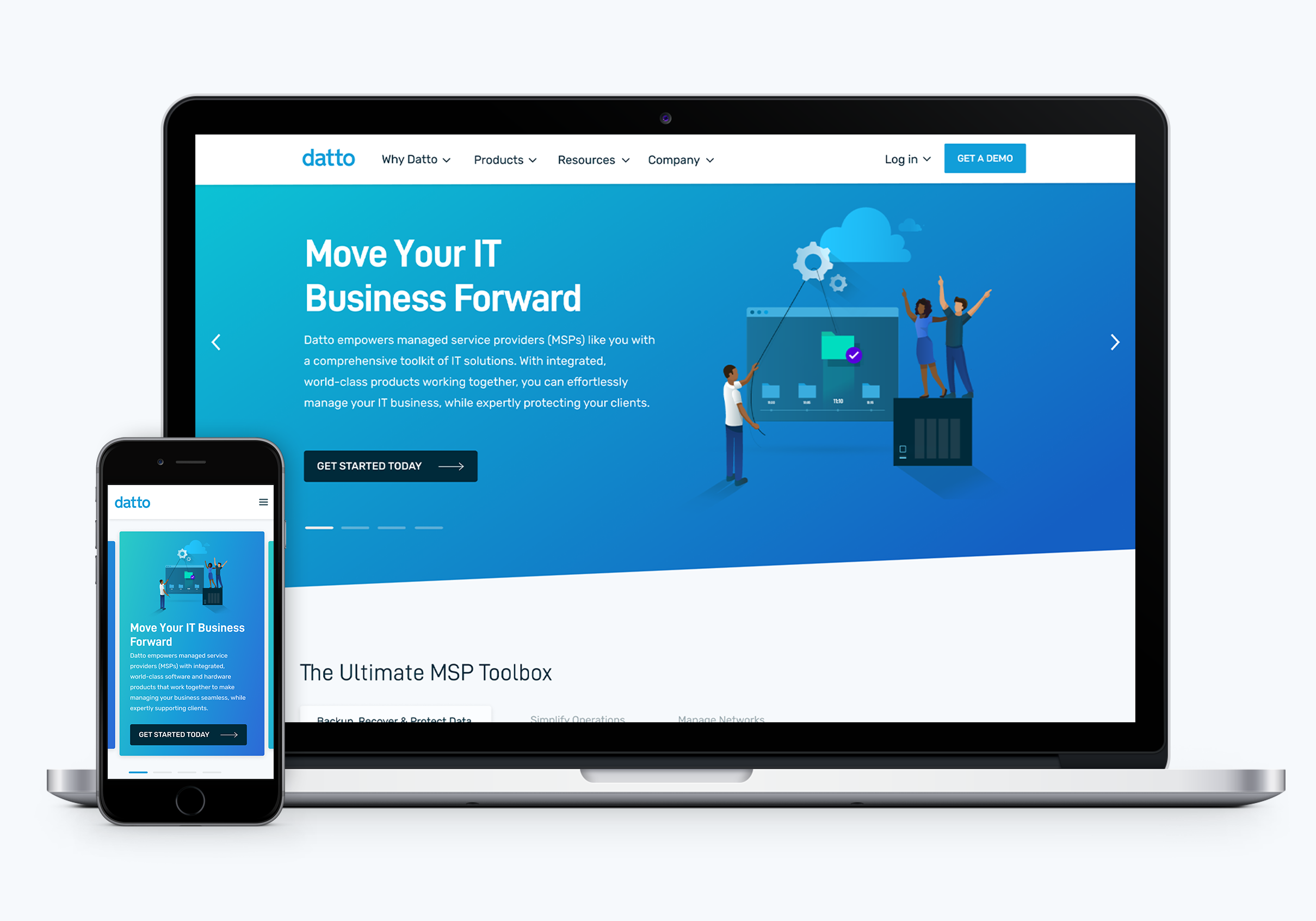
In 2020, I spearheaded the update of Datto's homepage, navigation/product dropdown, and footer as part of a new product launch initiative. Having originally designed the homepage in 2019, this project presented a valuable opportunity to incorporate user feedback and further enhance the user experience.
The problem
Through user interviews conducted for our website, we identified several challenges with the old designs, including a lack of conversions from the homepage to product pages.
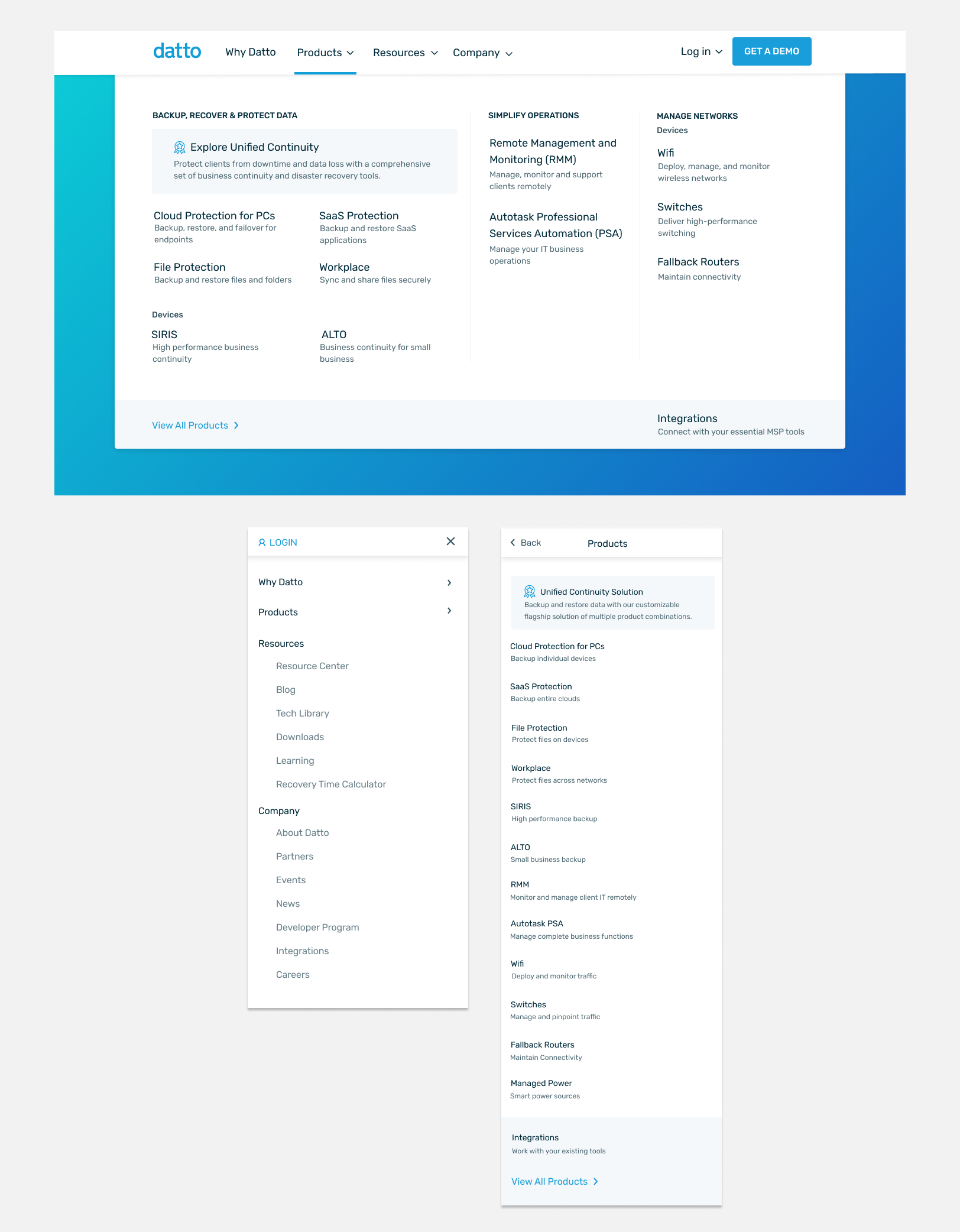
Homepage
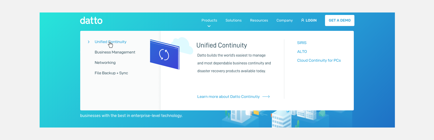
Navigation/ Product Dropdown

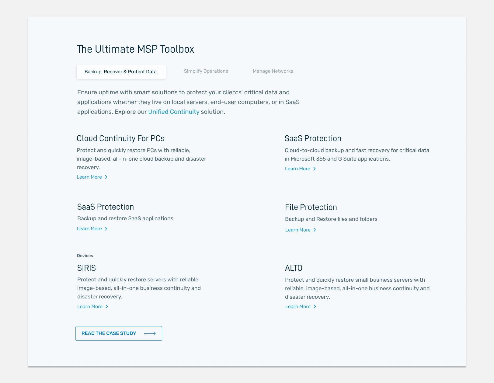
Footer
THE GOAL
Based off the users need I came up with a few key solutions for the new design.
THE PROCESS
I completed a competitive analysis of other websites with complex navigation to determine the best way to consolidate and display the different product areas.
View analysis deck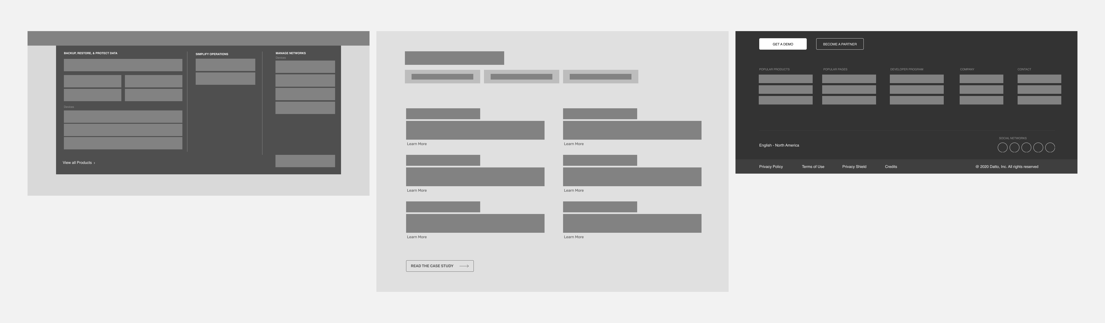
ITERATING
I experimented with various navigation widths, icon styles, and color combinations.
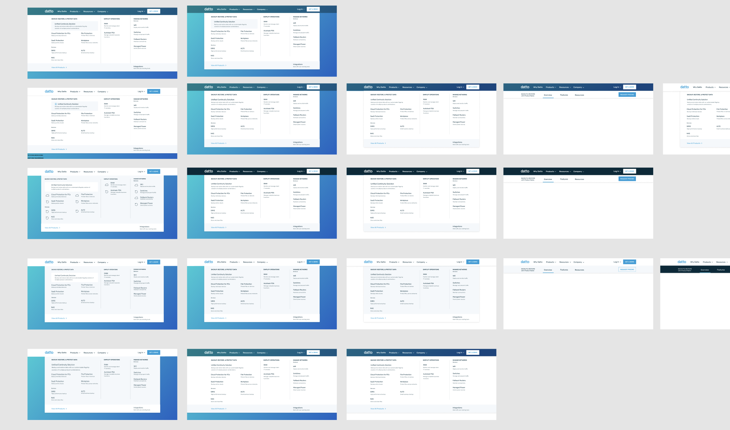
The revamped navigation now organizes products into distinct content pillars, prominently showcasing our packaged product solution. Each product is accompanied by a brief, scannable description of its purpose. Additionally, the navigation now opens upon click, eliminating the previous issue of disappearing on hover and providing a smoother browsing experience.
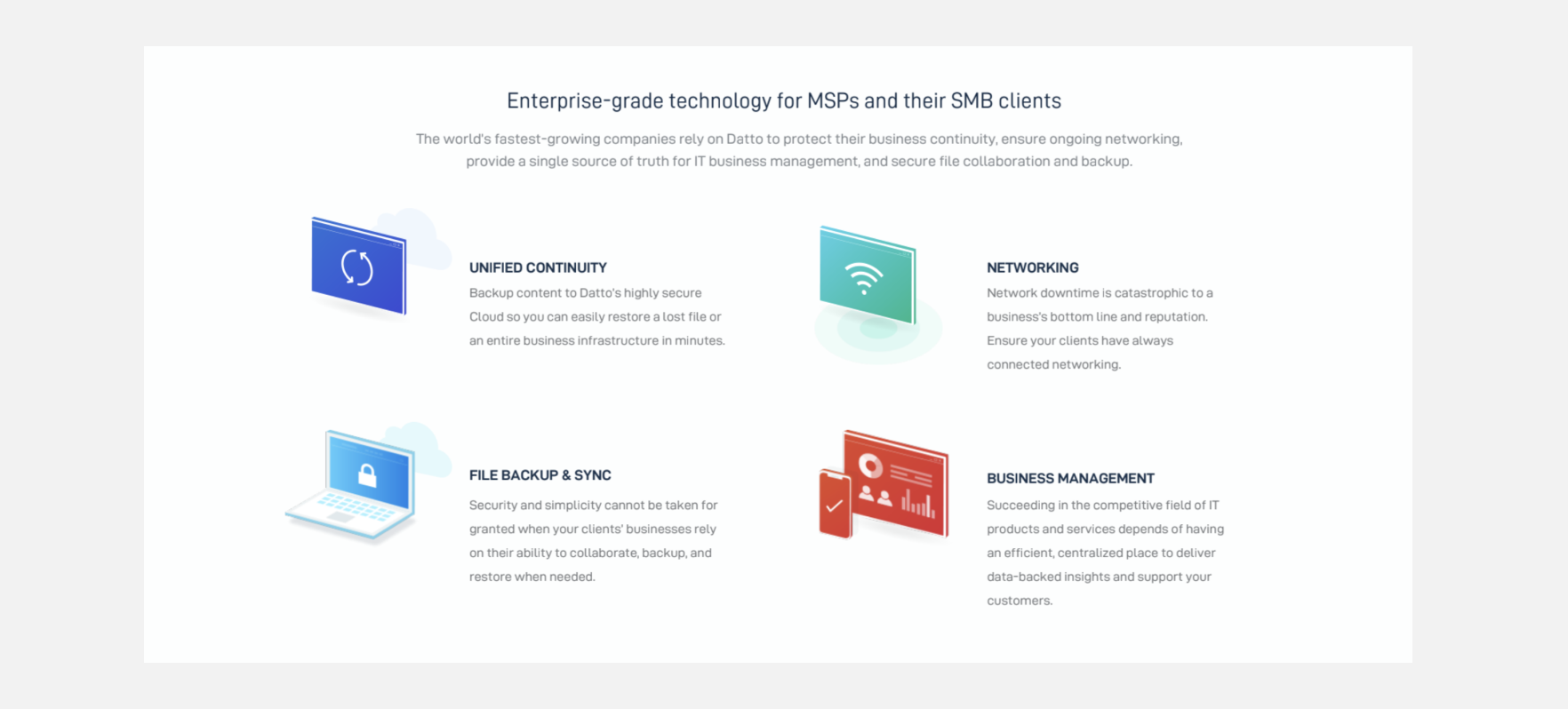
The redesigned product section mirrors the navigation flow but enhances it with more detailed descriptions. Positioned at the top of the homepage, it provides users with a comprehensive overview of our offerings as soon as they land on the site.
The footer has been revamped to display only the most popularly clicked or searched functions, grouped into easily scannable sections. This update also minimizes distracting blue text, improving user focus and readability.


If you like what you see and want to work together, get in touch!
victoriaLbragg@gmail.com